Turn on suggestions
Auto-suggest helps you quickly narrow down your search results by suggesting possible matches as you type.
Showing results for
- SS&C Blue Prism Community
- Get Connected
- Community Ideas
- Change in Font Color
Options
- Subscribe to RSS Feed
- Mark as New
- Mark as Read
- Bookmark
- Subscribe
- Email to a Friend
- Printer Friendly Page
- Report Inappropriate Content
EVIPUTI
MVP
Options
- Subscribe to RSS Feed
- Mark as New
- Mark as Read
- Bookmark
- Subscribe
- Email to a Friend
- Printer Friendly Page
- Report Inappropriate Content
01-12-20
04:53 PM
Status:
Delivered
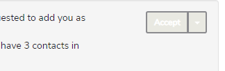
Its about simple font color , say for example color of "Accept" button when we receive a friend request . Its not very friendly. Its literally impossible to see what's written there and some more places like clear button etc .
Can we either give a night mode or a dark theme of some of the session's\layouts of community as this might help with the background effects.


Can we either give a night mode or a dark theme of some of the session's\layouts of community as this might help with the background effects.
3 Comments
You must be a registered user to add a comment. If you've already registered, sign in. Otherwise, register and sign in.
Idea Statuses
- New 11
- Duplicate 6
- Needs More Info 1
- Reviewed 4
- Under Consideration 4
- Not Planned 36
- Planned 0
- Planned-Later 0
- Planned-Next 0
- Planned-Now 0
- Delivered 37
